Tabs, and some groundwork for testing

Shufflizer now sports Angular Material tabs along the bottom edge of the window. This provides a more conventional way to navigate between the app’s pages and also gives me a place to implement an options/features page when I get to working on that.

In addition, under the hood I put all the http calls to Spotify into their own service. This is what the Angular documentation’s HTTP page recommends. It helped me implement better error handling, and better positions the code to take advantage of Jasmine and Karma testing (which I learned how to do at the Angular Denver 2018 conference, and am looking forward to trying out in Shufflizer).

One other thing: immediately upon upload Shufflizer will start playing the playlist in Spotify, if you have a device active, running Spotify.

A more inviting playlist picker

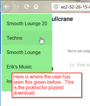
I have been using the Angular Material mat-menu for playlist selection. It’s Material Design’s version of a drop-down select, a classic original GUI prompt concept. There was a problem with long picklists on iPad, maybe due to the modification I did to make the picklist larger – for less scrolling. Also, I wanted a more modern and obvious UI. The user pretty much cannot do anything until picking a playlist. So let’s make picking the playlist a bigger deal up front.

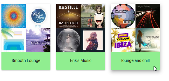
I decided to get rid of the mat-menu and present each playlist as a clickable card. I knew this would be more work, and it was, but it was worth it.

Tabbing

Mat-menu supports the tab key. Once the drop-down appears, the tab key works to move through items. I want the same thing for my cards. So I added tabindex=0 to each card.

A tab key user likely will use the keyboard then to select – either the enter key or the space bar. With tabindex=0 the user can tab to a card, but then neither the enter key nor the space bar work for select. No key does. I solved this by binding to the keyup event, and making my function accept an optional parameter that gives me the keystroke. These lines of code are on each card:

style="margin:10px;cursor:pointer"
tabindex=0
(click)="onSelectPlaylist(PI)"
(keyup)="onSelectPlaylist(PI,$event.key)"

Then, in my function:

onSelectPlaylist(I: number, key?: string): void {
  if (key && !key.match(/^( |Enter)$/)) {return}
  ...

Space bar really does send a single byte blank character through $event.key. The enter key, however, sends the string “Enter”. So my regular expression for space or enter is

/^( |Enter)$/

If the user triggers the function with any key other than space or enter, the function instantly returns, doing nothing.

Toggling

Just as with a classic drop-down select list, we want the cards to disappear when the user makes a selection, and of course reappear if the user wants to make a different selection. I spent a lot of time on this, trying many different user interface ideas. Here are a few things I learned along the way.

Avoid using *ngIf to toggle the existence of Angular Material’s paginator.

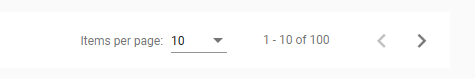
I advise this because if the user changes the items-per-page setting, it is lost when *ngIf removes the paginator from the DOM. This may not be a big deal at the time of removal, but be careful if the paginator might be subsequently restored.

Be sure hidden content is not tab selectable

I was using flex size zero to hide sections (eg. fxFlex=”0 1 0″ for the hidden state). I was horrified, however, when eventually I discovered that the user can still tab though, and trigger selection in, this hidden content. It’s much better to show/hide using [fxShow]. If you are unfamiliar with this syntax, it is from the nice flex-layout module that I am using.

Styling mat-menu items

Problem

I want Angular Material drop-down menu items to go wider before resorting to elipsis.

Here is a simplified example.  Angular Material cuts off the item, displaying elipsis

html:

<mat-menu #playlistMenu="matMenu">
  <button mat-menu-item>
    aaaa bbbb cccc dddd eeee ffff gggg hhhh iiii jjjj kkkk llll
  </button>
</mat-menu>
<button mat-button class="mat-title" 
  [matMenuTriggerFor]="playlistMenu">
  Playlist <i class="material-icons">arrow_drop_down</i>
</button>

Results:

Solution

By providing my own class with a selector that is more specific than what Angular Material is using, my style declarations come in as overrides.  All other stylings remain in effect.

In styles.css:

div.plMenuCSS { 
  max-width:500px;
  background-color:lightgreen;
  }

Then in the html:

<mat-menu #playlistMenu="matMenu">
  <button mat-menu-item class="plMenuCSS">
    aaaa bbbb cccc dddd eeee ffff gggg hhhh iiii jjjj kkkk llll
  </button>
</mat-menu>
<button mat-button class="mat-title" 
  [matMenuTriggerFor]="playlistMenu">
  Playlist <i class="material-icons">arrow_drop_down</i>
</button>

Results:

Look of mat-raised-button verses mat-card

I choose raised for my upload to Spotify button because I wanted to convey its significance over the other buttons on the page.  The upload button commits the user’s changes.  Everything else is “just playing around” and easily discarded until the user clicks this button.  It’s the “serious” button.

One morning, looking at my interface with a fresh mind, I realized this creates an inconsistent UI when also using mat-card.  They both have the same raised style:

A user might think “the session minutes remaining button doesn’t do anything when I click it.”  It’s not a button but it looks like the button that is sitting right next to it, the most serious button of all.

I could have changed the upload button to a flat button, so it would be consistent with all of the other buttons on the page, but I still wanted to set it apart somehow.  So I decided to make it green.  My picklist for downloading a playlist is also green.  With this change, I am consistently using the color green to indicate where the user initiates playlist data transfer with Spotify, download and upload.  I like the tie to Spotify’s branding color, which is a similar shade of green.

This still leaves the upload button and the card with the same raised style, but I am satisfied.  When I make Shufflizer available to users, I will get some feedback about this.


Scroll only a portion of the screen with flexbox

So far I am finding that flexbox does indeed work well for positioning and sizing items within the viewport.  I like its approach when we are creating an app rather than a document, and of course this usually is the case with Angular.  Here is an example.

A perfect scrollbar

Do you have content you want to stay at the top of the window instead of scroll away?  This means you have to take control of your content sizing such that the operating system’s native scrollbar for the window never appears.  This comes naturally to flexbox.  When there is only one flex item it takes all of the space – all of the remaining space, to be precise.  So use two div’s, with just the second one designated flex.  The first div will stay fixed at the top.  The second div will scroll.  There will be no wasted space, and no double scrollbars.  Here it is in pure HTML/CSS:

<html>
<body>
<div style="display:flex;
  flex-flow:column;
  height:100%">
  <div>my fixed content</div>
  <div style="flex:1;overflow-y:auto;">
    <p>my scrolling content</p>
    ... lots of content here ...
  </div>
</div>
</body>
</html>

In Angular we can use the flex-layout module to express the div tags more concisely:

<div fxLayout="column" style="height:100%">
  <div>my fixed content</div>
  <div fxFlex style="overflow-y:auto">
    <p>my scrolling content</p>
    ... lots of content here ...
  </div>
</div>

Here is an image of the results I get using this technique in my Shufflizer app:

[14-May-2018 For some reason, in Shufflizer I had to specify 100vh instead of 100%.  Using 100% resulted in simple whole app scrolling.  Using vh instead solved it except eventually I noticed a problem in MicroSoft Edge – div’s overlapped as if they didn’t know about each other, all starting at the top of the viewport.  So I went back to the pure HTML/CSS way, but using vh instead of %.  That worked in all the browsers I am testing (FireFox, Edge, Chrome).]

Flex-layout performance solution

In my previous blog post, I described a performance problem with the special responsive features of the Angular flex-layout module.  Combined use of fxShow and fxHide was killing my app’s performance.  Example:

<button mat-button fxHide="true" fxShow.gt-sm="true"

As I studied the documentation more I learned that the above syntax is overkill.  The following is easier and does the same thing:

<button mat-button fxHide fxShow.gt-sm

This simplification makes no difference in performance, however.

The .gt-sm means “when greater than small.”  A few HTML tags like this one don’t hurt, but I might have a few thousand, generated by an ngFor.

Solution:  go imperative – use flex-layout’s ObservableMedia

The “dot” modifiers like the .gt-sm shown above are known as mediaQuery alias suffixes.   While they are one of the main attractions of the flex-layout module’s responsive API, I got rid of them all.  Eventually I went ahead and removed the static API also.

<button mat-button fxHide fxShow.gt-sm
                      ^     ^
                      |     |
remove static API ----+     +--- remove responsive API

I put in flex-layout’s way of checking mediaQuery changes, the isActive method of the ObservableMedia service.  This is in my main app.component.ts.  Here are the relevant parts:

import { ObservableMedia } from '@angular/flex-layout';
...
constructor (
 public media: ObservableMedia,
...
sizeNum: Object = {'PHONE':1,'TABLET':2,'HD':3}
activeSize(): number {
 if (this.media.isActive('xs')) {return this.sizeNum['PHONE'];}
 if (this.media.isActive('sm')) {return this.sizeNum['TABLET'];}
 else {return this.sizeNum['HD'];}
 }

Now I can use ngIf in my html:

<button mat-button *ngIf="activeSize()>=sizeNum['HD']"

In addition to implementing show/hide logic, I also was using mediaQuery alias suffixes on ngClass.  Now I am doing this instead:

TypeScript

classList(size:number): string[] {
  if (size>=this.sizeNum['HD'])          {return ['small']}
  else if (size>=this.sizeNum['TABLET']) {return ['tiny']}
  else                                   {return ['nano']}
  }

HTML

<img [src]="songImgUrl()"
  class="rounded"
  [ngClass]="classList(activeSize())"
Conclusion

The turning point was removing the responsive API directives.  That restored the performance but I had some constructs like this:

<button mat-button [fxShow]="activeSize()>=sizeNum['HD']"

This is the same thing as Angular’s stock ngIf.  So I decided to switch everything to native Angular DOM directives and use only the ObservableMedia from flex-layout.  I am satisfied with this solution because:

  • the performance is fully restored
  • it’s almost entirely stock Angular
  • it’s clear that I am setting up just three breakpoints
  • it still taps into, rather than duplicates, the Material Design breakpoints

[25-Jun-2018 I can do constants better now. See global constants.]

Flex-layout performance problem

When I was first developing Shufflizer, I resisted making it break into pages for large playlists.  Scrolling a 2000 item list really isn’t that big of a deal.  Spotify’s native Windows app doesn’t bother with paging, why should I?

I get album art images, however, and eventually I admitted to myself that this was slowing down the initial load for large playlists.  Since I really wanted album art images, but without unusually long load times, I was faced with the choice of either lazy loading images or putting in paging.  I tried a lazy loading solution and did not like it.  Plus I realized that the first and last songs would be the most commonly accessed, given the way the app was shaping up, and that paging would not hinder this use pattern much if I put in first and last buttons.  So I opted for paging.

I am using Angular Material, so I proceeded with its data table paging component.

This all worked rather well.

If the user opted for a large page size with a big playlist, it took a few moments to render but there was some sense of the cause – having just picked a large page size.  Then after the initial render time, the app performed amazingly well.  In the old days before Angular I would have to code my own optimized “surgical” manipulation of the DOM in order to get the kind of performance Angular was giving me automatically.

If the user left the page size setting unchanged, then initial load time was good and the most common use case still worked fine.

Then I introduced the flex-layout responsive API and performance really took a hit.

I got excited when I discovered the special responsive features of the flex-layout module.  Now I could make adjustments to the layout based on the screensize.  These are not flex css directives, but are delivered along with the flex-layout package as additional tools for adjusting “specific, non-flexbox styles when a specific mediaQuery has activated.”  Standard break-points are provided for screen widths:

xs (extra-small) <600 px
sm (small) 600 to 959 px
md (medium)  960 to 1279 px
lg (large)  1280 to 1919 px
xl (extra-large)  1920 to 5000 px

I laced the HTML with the markup. Here is an example.  The default is this button does not show (fxHide), but if the screen width is greater than small, then the button renders (fxShow.gt-sm):

<button mat-button fxHide="true" fxShow.gt-sm="true" ...

I liked the resulting phone, tablet, and HD layouts I came up with, but was only working with my default 100 item pages while developing.  It was a bit slower but not bad.  Then I finally tried the next notch up – 500 items per page.  The app ground to a halt.

I think it is doing what some people call “layout thrashing.”

I am going to play around with the mediaquery directives and see if I can improve this.

Problem with height:calc

I’ve been setting the height of one of my div tags using the calc construct.  Here is a simplified example:

<div style="height:calc(100%-230px); overflow:auto">
my div stuff
</div>

This keeps my div on the screen and when the div gets big enough (my div stuff is replaced with a ton of stuff) it sprouts  its own scrollbar instead of the scrollbar for the whole window appearing.

After upgrading from Angular 5.0 to 5.2, this stopped working.  It was as if my specification for height simply was not there.  The window scrollbar would appear and my whole app would scroll.

I found a work-around.  Specify the percent instead as a vh (viewport height):

<div style="height:calc(100vh-230px); overflow:auto">
my div stuff
</div>

When I upgraded Angular, I also obtained the latest flex-layout and angular-material.  It could be that this problem is from one of these libraries, instead of Angular 5.2 itself.