Problem
I want Angular Material drop-down menu items to go wider before resorting to elipsis.
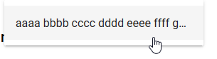
Here is a simplified example. Angular Material cuts off the item, displaying elipsis
html:
<mat-menu #playlistMenu="matMenu">
  <button mat-menu-item>
    aaaa bbbb cccc dddd eeee ffff gggg hhhh iiii jjjj kkkk llll
  </button>
</mat-menu>
<button mat-button class="mat-title"
  [matMenuTriggerFor]="playlistMenu">
  Playlist <i class="material-icons">arrow_drop_down</i>
</button>
Results:
Solution
By providing my own class with a selector that is more specific than what Angular Material is using, my style declarations come in as overrides. All other stylings remain in effect.
In styles.css:
div.plMenuCSS {
  max-width:500px;
  background-color:lightgreen;
  }
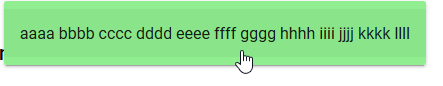
Then in the html:
<mat-menu #playlistMenu="matMenu">
  <button mat-menu-item class="plMenuCSS">
    aaaa bbbb cccc dddd eeee ffff gggg hhhh iiii jjjj kkkk llll
  </button>
</mat-menu>
<button mat-button class="mat-title"
  [matMenuTriggerFor]="playlistMenu">
  Playlist <i class="material-icons">arrow_drop_down</i>
</button>
Results: