I choose raised for my upload to Spotify button because I wanted to convey its significance over the other buttons on the page. The upload button commits the user’s changes. Everything else is “just playing around” and easily discarded until the user clicks this button. It’s the “serious” button.
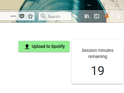
One morning, looking at my interface with a fresh mind, I realized this creates an inconsistent UI when also using mat-card. They both have the same raised style:
A user might think “the session minutes remaining button doesn’t do anything when I click it.” It’s not a button but it looks like the button that is sitting right next to it, the most serious button of all.
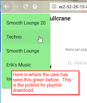
I could have changed the upload button to a flat button, so it would be consistent with all of the other buttons on the page, but I still wanted to set it apart somehow. So I decided to make it green. My picklist for downloading a playlist is also green. With this change, I am consistently using the color green to indicate where the user initiates playlist data transfer with Spotify, download and upload. I like the tie to Spotify’s branding color, which is a similar shade of green.
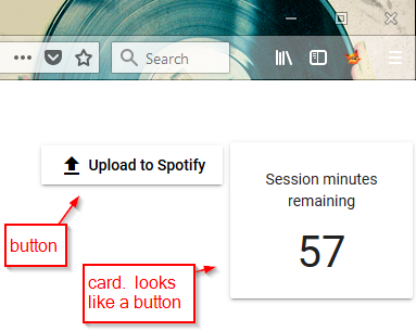
This still leaves the upload button and the card with the same raised style, but I am satisfied. When I make Shufflizer available to users, I will get some feedback about this.