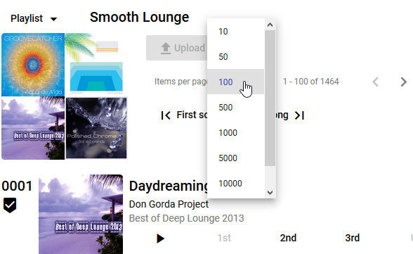
When I was first developing Shufflizer, I resisted making it break into pages for large playlists. Scrolling a 2000 item list really isn’t that big of a deal. Spotify’s native Windows app doesn’t bother with paging, why should I?
I get album art images, however, and eventually I admitted to myself that this was slowing down the initial load for large playlists. Since I really wanted album art images, but without unusually long load times, I was faced with the choice of either lazy loading images or putting in paging. I tried a lazy loading solution and did not like it. Plus I realized that the first and last songs would be the most commonly accessed, given the way the app was shaping up, and that paging would not hinder this use pattern much if I put in first and last buttons. So I opted for paging.
I am using Angular Material, so I proceeded with its data table paging component.

This all worked rather well.
If the user opted for a large page size with a big playlist, it took a few moments to render but there was some sense of the cause – having just picked a large page size. Then after the initial render time, the app performed amazingly well. In the old days before Angular I would have to code my own optimized “surgical” manipulation of the DOM in order to get the kind of performance Angular was giving me automatically.
If the user left the page size setting unchanged, then initial load time was good and the most common use case still worked fine.
Then I introduced the flex-layout responsive API and performance really took a hit.
I got excited when I discovered the special responsive features of the flex-layout module. Now I could make adjustments to the layout based on the screensize. These are not flex css directives, but are delivered along with the flex-layout package as additional tools for adjusting “specific, non-flexbox styles when a specific mediaQuery has activated.” Standard break-points are provided for screen widths:
| xs (extra-small) | <600 px |
| sm (small) | 600 to 959 px |
| md (medium) | 960 to 1279 px |
| lg (large) | 1280 to 1919 px |
| xl (extra-large) | 1920 to 5000 px |
I laced the HTML with the markup. Here is an example. The default is this button does not show (fxHide), but if the screen width is greater than small, then the button renders (fxShow.gt-sm):
<button mat-button fxHide="true" fxShow.gt-sm="true" ...
I liked the resulting phone, tablet, and HD layouts I came up with, but was only working with my default 100 item pages while developing. It was a bit slower but not bad. Then I finally tried the next notch up – 500 items per page. The app ground to a halt.
I think it is doing what some people call “layout thrashing.”
I am going to play around with the mediaquery directives and see if I can improve this.
