Playlist song display

Each entry in a playlist is a song, displaying the song title, artist, and album.

On the left, the song’s position in the playlist is displayed, and also the beenhere listen indicator.  This indicator tells whether you have listened to the song recently in Spotify.  Songs with the beenhere listen indicator are pushed to the bottom of the playlist when you randomize.  If you click on the indicator, it clears.

The play button plays a preview clip of the song.  This does not count as a listen in Spotify.  It will not influence the beenhere listen indicator.

The remaining buttons are song position controls.  Clicking 1st move the song to the first position.  This example song already is in the first position, so the button is disabled.  Clicking down moves the song down one position.  In the tablet and hd layouts a few more buttons like these appear, such as an up button.

The rand button is the main attraction.  Think of it as the Shufflize button.  It randomizes the order of the songs, starting with the song you have clicked.  Songs above do not move.  Songs with the beenhere listen indicator are moved to the end of the playlist.

Downloading. Uploading.

Shufflizer download

When Shufflizer says it is downloading it means just the track listing, not the songs themselves:

Shufflizer upload

In Shufflizer, when you are done editing  a playlist, you upload it.  This commits your edits to Spotify:

There is a date added for each song in a Spotify playlist.  Because Shufflizer upload is redefining the playlist, all of these dates change to the current date.  Here is an example showing the dates in the Spotify desktop app, right after an upload from Shufflizer:

Spotify download

Spotify also has a download.  It means something different.  In Spotify, download means downloading the songs themselves, so you can then play them without incurring data charges or when you don’t have an Internet connection.

Shufflizer doesn’t know about and is not in any way affected by Spotify download.


Dups. Local files.

Dups

Shufflizer automatically removes duplicates from your playlist.  When it does this, it lets you know with an alert.

It was simpler for me to make Shufflizer delete duplicates than to make it accommodate them.  A fundamental motivation for Shufflizer is to not hear songs repeated.  Having the same song more than once in a playlist undermines this.

Local files

Shufflizer automatically removes local files from your playlist.  When it does this, it lets you know with an alert.

Probably most Spotify users don’t have local files in their playlists, or even know what they are.  Local files are mp3’s you have on your PC that you want Spotify to play.  They are not supported by the underlying technology upon which Shufflizer is built, the Spotify Web API, so I must remove them.

Don’t like these automatic actions?

Shufflizer isn’t immediately changing your playlist in Spotify when you see either of these alerts, and it certainly isn’t going to delete any files from your PC.  Shufflizer is making these adjustments to the copy of the playlist it is loading for you to edit.  A playlist is just a track listing, not the songs themselves, and no changes to your playlist are saved until you upload.  Don’t like these automatic actions?  Don’t upload.


Session timer solution

In my previous blog post I described a flaw in my implementation of a session timer.  Spotify doesn’t provide a way to monitor how much time is left but we know that the session lasts for sixty minutes, so I start my own sixty minute timer.  My problem was that I was inadvertently creating more than one.

A singleton timer

My solution is to create a singleton timer, by subscribing only once.  Instead of my class exposing the observable, it exposes the results – a simple numeric variable for the minutes remaining:

Observable.timer(0, 60000)
  .map(mins => 60 - mins)
  .takeWhile(minsRemaining => minsRemaining >= 0)
  .subscribe(x => this.minsRemaining=x);

In the HTML, I rely on Angular to automatically detect changes to minsRemaining.  Here is the button disable expression now.  The async pipe subscribe is gone:

<button (click)="uploadToSpotify()" mat-raised-button
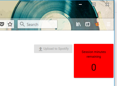
  [disabled]="!playlistIsEdited()||minsRemaining<=0">
  <i class="material-icons">file_upload</i>Upload to Spotify
</button>

I had two other subscribes, not just one more, as I thought in my previous post.  I removed them.  Now everything references minsRemaining:

<mat-card style="width:120px;text-align:center;" 
  [style.background-color]="minsRemaining <= 5 ? 'red' : 'transparent'">
  <mat-card-content>Session minutes remaining</mat-card-content>
  <mat-card-content style="font-size:30pt;padding-top:10px;padding-bottom:10px;">
    {{minsRemaining}}
  </mat-card-content>
</mat-card>
Survive not only page reloads, but also sleeping

With the above in place, I started working on how to keep it accurate through page reloads.  I got something working, but then found that timer stalls when a PC goes to sleep.  I’d wake up a sleeping PC and the timer was off by the number of minutes slept.

So I changed to examining time elapsed on the clock, rather than trying to make my process accurately tick each minute.  The following code survives both page reloads and sleeping.

I am refreshing every five seconds now.  This keeps my precision to within 5 seconds after page reload or sleeping.  The 3600 is 60 minutes in seconds:

// sessionStorage survives page reloads

if (!sessionStorage.getItem(this.accessToken)) {
  sessionStorage
  .setItem(this.accessToken,Date.now().toString());
  }

//Date.now()-startedAt survives sleeping

Observable.timer(0,5000)
  .map(() => parseInt(sessionStorage.getItem(this.accessToken)))
  .map(startedAt => 3600-(Date.now()-startedAt)/1000)
  .map(secsRemaining => Math.ceil(secsRemaining/60))
  .takeWhile(minsRemaining => minsRemaining >= 0)
  .subscribe(x => this.minsRemaining=x);
expires_in=3600

Spotify indicates the number of seconds for the session in the url they return.  It’s always been 3600 seconds, which is 60 minutes, but if they ever do return something different, I should honor it.  So instead of hardcoding 3600, I parse it out of the url.  This is not some sophisticated thing that I could tap into to find out how much time is left.  It’s simply how many seconds total the token is good for.  It stays the same even when the page is refreshed.

try {this.expiresIn=parseInt(
  window.location.hash.match(/expires_in=(\d+)/)[1]
  );}
catch (ERR) {this.expiresIn=0}

// sessionStorage survives page reloads

if (!sessionStorage.getItem(this.accessToken)) {
  sessionStorage
  .setItem(this.accessToken,Date.now().toString());
  }

//Date.now()-startedAt survives sleeping 

Observable.timer(0,5000)
  .map(() => parseInt(sessionStorage.getItem(this.accessToken)))
  .map(startedAt => this.expiresIn-(Date.now()-startedAt)/1000)
  .map(secsRemaining => Math.ceil(secsRemaining/60))
  .takeWhile(minsRemaining => minsRemaining >= 0)
  .subscribe(x => this.minsRemaining=x);


Session timer problem

Spotify’s web API uses OAuth for user authentication.  I am using the option that produces an access token that works for sixty minutes and then expires.  I want the user to know about this, so that it is clear what has happened if the session expires.  Ordinary use of Shufflizer should not take more than a minute or two, but, of course, users can behave differently from what we expect, including simply leaving the app sitting open for a while and then returning.

My initial solution

I have created an Observable.timer that counts down minutes.  I render this in a box.  I turn the background red when we are down to five minutes.  When we are down to zero then I also disable the upload to spotify button.  It isn’t going to work any more.

Problem:  Observable.timer is cold

This has been working, but not exactly right.  After a bit of testing I have concluded that timer is a cold observable, rather than hot.  I am starting two sixty minutes timers, not one.  The first timer starts when the page loads.  It is reported in the box.  This is good.  The second timer starts when the user makes an edit to the playlist.  It controls the disable of the button.  This is bad.  Waiting until the user makes an edit is not what I intended and is not accurate.

Here is my observable.  This counts down minutes from 60:

this.sessionCountdown = Observable.timer(0, 60000)
  .map(mins => 60 - mins)
  .takeWhile(minsRemaining => minsRemaining >= 0);

My problem is in my HTML template, in my TypeScript expression for the disable.  TypeScript’s or operator (the double-bar ||) does not execute its second part unless its first part is false.  I coded an async pipe subscribe for the second part, not realizing that this subscribe creates its own instance of the timer.  The user finally makes an edit to the playlist.  Only then does TypeScript flop over to the other side of the double-bar, therefore starting the timer:

<button (click)="uploadToSpotify()"
  mat-raised-button
  [disabled]="!playlistIsEdited()||(sessionCountdown | async)<=0">
  <i class="material-icons">file_upload</i>
  Upload to Spotify
</button>

I am going to work on making the timer a singleton, so that I get something more like a hot observable.

While I am working on this, I also need to deal with page reloads.  I think I will do that with session storage.  The timer should not start over if the page reloads.

Scroll only a portion of the screen with flexbox

So far I am finding that flexbox does indeed work well for positioning and sizing items within the viewport.  I like its approach when we are creating an app rather than a document, and of course this usually is the case with Angular.  Here is an example.

A perfect scrollbar

Do you have content you want to stay at the top of the window instead of scroll away?  This means you have to take control of your content sizing such that the operating system’s native scrollbar for the window never appears.  This comes naturally to flexbox.  When there is only one flex item it takes all of the space – all of the remaining space, to be precise.  So use two div’s, with just the second one designated flex.  The first div will stay fixed at the top.  The second div will scroll.  There will be no wasted space, and no double scrollbars.  Here it is in pure HTML/CSS:

<html>
<body>
<div style="display:flex;
  flex-flow:column;
  height:100%">
  <div>my fixed content</div>
  <div style="flex:1;overflow-y:auto;">
    <p>my scrolling content</p>
    ... lots of content here ...
  </div>
</div>
</body>
</html>

In Angular we can use the flex-layout module to express the div tags more concisely:

<div fxLayout="column" style="height:100%">
  <div>my fixed content</div>
  <div fxFlex style="overflow-y:auto">
    <p>my scrolling content</p>
    ... lots of content here ...
  </div>
</div>

Here is an image of the results I get using this technique in my Shufflizer app:

[14-May-2018 For some reason, in Shufflizer I had to specify 100vh instead of 100%.  Using 100% resulted in simple whole app scrolling.  Using vh instead solved it except eventually I noticed a problem in MicroSoft Edge – div’s overlapped as if they didn’t know about each other, all starting at the top of the viewport.  So I went back to the pure HTML/CSS way, but using vh instead of %.  That worked in all the browsers I am testing (FireFox, Edge, Chrome).]

Flex-layout performance solution

In my previous blog post, I described a performance problem with the special responsive features of the Angular flex-layout module.  Combined use of fxShow and fxHide was killing my app’s performance.  Example:

<button mat-button fxHide="true" fxShow.gt-sm="true"

As I studied the documentation more I learned that the above syntax is overkill.  The following is easier and does the same thing:

<button mat-button fxHide fxShow.gt-sm

This simplification makes no difference in performance, however.

The .gt-sm means “when greater than small.”  A few HTML tags like this one don’t hurt, but I might have a few thousand, generated by an ngFor.

Solution:  go imperative – use flex-layout’s ObservableMedia

The “dot” modifiers like the .gt-sm shown above are known as mediaQuery alias suffixes.   While they are one of the main attractions of the flex-layout module’s responsive API, I got rid of them all.  Eventually I went ahead and removed the static API also.

<button mat-button fxHide fxShow.gt-sm
                      ^     ^
                      |     |
remove static API ----+     +--- remove responsive API

I put in flex-layout’s way of checking mediaQuery changes, the isActive method of the ObservableMedia service.  This is in my main app.component.ts.  Here are the relevant parts:

import { ObservableMedia } from '@angular/flex-layout';
...
constructor (
 public media: ObservableMedia,
...
sizeNum: Object = {'PHONE':1,'TABLET':2,'HD':3}
activeSize(): number {
 if (this.media.isActive('xs')) {return this.sizeNum['PHONE'];}
 if (this.media.isActive('sm')) {return this.sizeNum['TABLET'];}
 else {return this.sizeNum['HD'];}
 }

Now I can use ngIf in my html:

<button mat-button *ngIf="activeSize()>=sizeNum['HD']"

In addition to implementing show/hide logic, I also was using mediaQuery alias suffixes on ngClass.  Now I am doing this instead:

TypeScript

classList(size:number): string[] {
  if (size>=this.sizeNum['HD'])          {return ['small']}
  else if (size>=this.sizeNum['TABLET']) {return ['tiny']}
  else                                   {return ['nano']}
  }

HTML

<img [src]="songImgUrl()"
  class="rounded"
  [ngClass]="classList(activeSize())"
Conclusion

The turning point was removing the responsive API directives.  That restored the performance but I had some constructs like this:

<button mat-button [fxShow]="activeSize()>=sizeNum['HD']"

This is the same thing as Angular’s stock ngIf.  So I decided to switch everything to native Angular DOM directives and use only the ObservableMedia from flex-layout.  I am satisfied with this solution because:

  • the performance is fully restored
  • it’s almost entirely stock Angular
  • it’s clear that I am setting up just three breakpoints
  • it still taps into, rather than duplicates, the Material Design breakpoints

[25-Jun-2018 I can do constants better now. See global constants.]

Flex-layout performance problem

When I was first developing Shufflizer, I resisted making it break into pages for large playlists.  Scrolling a 2000 item list really isn’t that big of a deal.  Spotify’s native Windows app doesn’t bother with paging, why should I?

I get album art images, however, and eventually I admitted to myself that this was slowing down the initial load for large playlists.  Since I really wanted album art images, but without unusually long load times, I was faced with the choice of either lazy loading images or putting in paging.  I tried a lazy loading solution and did not like it.  Plus I realized that the first and last songs would be the most commonly accessed, given the way the app was shaping up, and that paging would not hinder this use pattern much if I put in first and last buttons.  So I opted for paging.

I am using Angular Material, so I proceeded with its data table paging component.

This all worked rather well.

If the user opted for a large page size with a big playlist, it took a few moments to render but there was some sense of the cause – having just picked a large page size.  Then after the initial render time, the app performed amazingly well.  In the old days before Angular I would have to code my own optimized “surgical” manipulation of the DOM in order to get the kind of performance Angular was giving me automatically.

If the user left the page size setting unchanged, then initial load time was good and the most common use case still worked fine.

Then I introduced the flex-layout responsive API and performance really took a hit.

I got excited when I discovered the special responsive features of the flex-layout module.  Now I could make adjustments to the layout based on the screensize.  These are not flex css directives, but are delivered along with the flex-layout package as additional tools for adjusting “specific, non-flexbox styles when a specific mediaQuery has activated.”  Standard break-points are provided for screen widths:

xs (extra-small) <600 px
sm (small) 600 to 959 px
md (medium)  960 to 1279 px
lg (large)  1280 to 1919 px
xl (extra-large)  1920 to 5000 px

I laced the HTML with the markup. Here is an example.  The default is this button does not show (fxHide), but if the screen width is greater than small, then the button renders (fxShow.gt-sm):

<button mat-button fxHide="true" fxShow.gt-sm="true" ...

I liked the resulting phone, tablet, and HD layouts I came up with, but was only working with my default 100 item pages while developing.  It was a bit slower but not bad.  Then I finally tried the next notch up – 500 items per page.  The app ground to a halt.

I think it is doing what some people call “layout thrashing.”

I am going to play around with the mediaquery directives and see if I can improve this.